%20Bold.png)
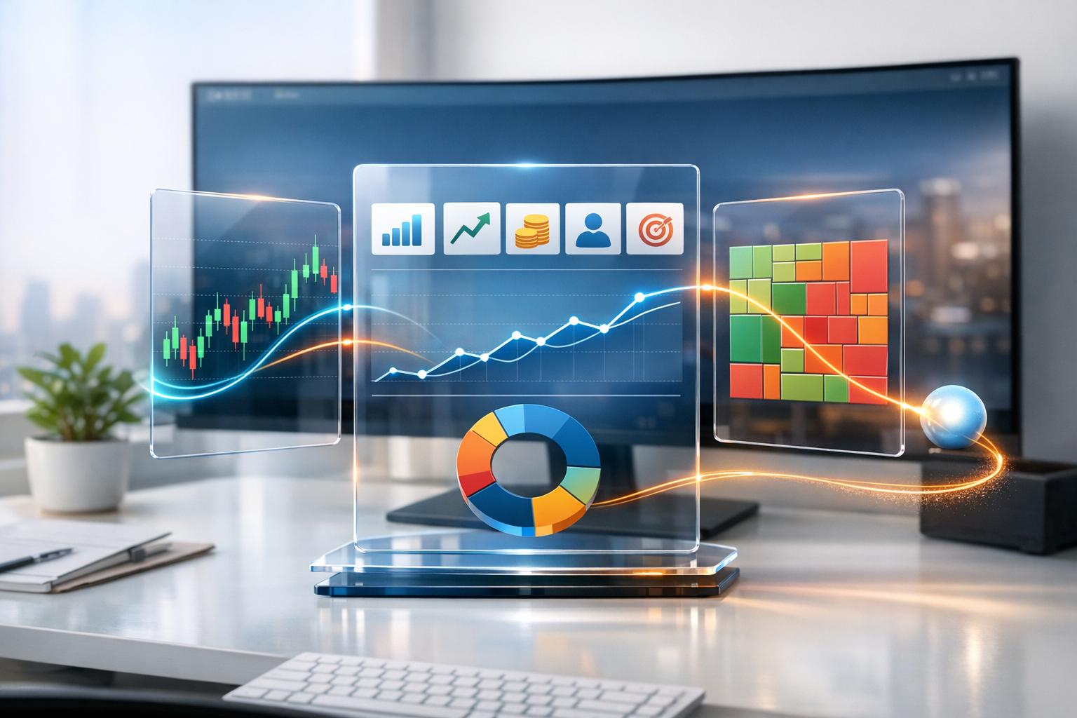
Financial data visualization simplifies complex financial information by transforming it into charts, graphs, and dashboards. This approach helps businesses quickly identify trends, patterns, and risks without relying on cumbersome spreadsheets. Here's why it matters:
Choosing the right tools is critical. Look for ease of use, integration with existing systems, and AI-driven insights for predictive analytics and real-time reporting. Effective visualizations should focus on key metrics like profit and loss, cash flow, and KPIs, using clear, intuitive designs tailored to different audiences.
To implement this successfully:
The best financial visualization tool is the one your team will actually use. If the interface feels overly complicated or too technical, chances are it will be ignored. A straightforward design ensures all users can access insights without constantly relying on IT support.
Consider tools with natural language processing (NLP) capabilities. Instead of crafting complex SQL queries, users can simply type questions like, "What was our cash flow last quarter?" and instantly receive visual answers [6]. This approach makes data more accessible, helping teams make faster decisions. Mobile-friendly tools are just as important - being able to check dashboards during client meetings, conferences, or while traveling keeps everyone informed and agile [4].
These user-friendly features help ensure the tool fits seamlessly into your existing systems.
A good visualization tool should integrate effortlessly with your current tech stack. Connecting it to platforms like QuickBooks, Xero, CRMs, or ERPs removes the need for manual data entry and ensures dashboards always display up-to-date numbers [2]. Automated data refreshes also minimize the risk of errors.
As your business grows, the volume of data will expand too. Scalable business intelligence (BI) tools are essential for managing complex, multi-source reporting [4]. With global data projected to hit 180 zettabytes by 2025, choosing a tool that can grow with your organization is a forward-thinking move [1].
Modern tools go beyond static charts, offering features that actively enhance strategic decision-making. AI-powered capabilities can shift your focus from simply reviewing past data to predicting future trends with tools like scenario modeling and predictive analytics [6][5].
Real-time reporting adds another layer of utility by turning static snapshots into live dashboards that update with every transaction. This immediacy allows teams to respond to market changes within moments [5]. AI features can also detect anomalies automatically, flagging unusual spending, budget overruns, or even potential fraud as soon as they occur [5][6].
The data visualization market is expected to grow to $18.36 billion by 2030, with a compound annual growth rate (CAGR) of 10.95% [6]. When choosing a tool, focus on options that provide customizable real-time alerts, adaptive learning to refine predictions, and the ability to combine both quantitative data and qualitative insights into a cohesive financial story.
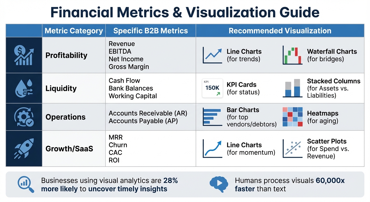
Financial Metrics and Recommended Visualization Types for B2B Businesses
Once you've chosen your tools, the next step is to track key financial metrics using clear and effective visualizations. Turning complex financial data into easy-to-understand visuals helps transform raw numbers into actionable insights. By sticking to the criteria discussed earlier - like ease of use, integration capabilities, and AI-powered insights - you ensure your tools can handle accurate and meaningful metric visualizations. These visual techniques make financial monitoring and decision-making more straightforward.
Profit and loss (P&L) statements are essential for tracking revenue, expenses, and net income over time. Line charts are ideal for visualizing trends in revenue and expenses across months or quarters [2]. If you need to show how revenue translates into net income, waterfall charts are your best option. These charts, often called "profit bridges", break down how total revenue decreases step-by-step through costs like COGS, operating expenses, and taxes, ultimately showing your bottom line [2][1].
To make these visuals even more intuitive, use green to represent gains and red for losses - this makes it easy for anyone, even non-finance team members, to understand [2]. Waterfall charts also shine when comparing budgets to actuals, highlighting areas where spending exceeded expectations or revenue fell short [2].
While P&L visuals focus on income, cash flow charts ensure you stay on top of liquidity.
Cash flow management revolves around understanding when cash enters and leaves your business. Stacked column charts are perfect for comparing assets against liabilities, offering a snapshot of financial health at a glance [2]. For real-time updates, KPI cards displaying total cash on hand and current bank balances provide an instant overview - great for dashboards that need to be checked frequently [2].
When managing accounts receivable aging, heatmaps are incredibly effective. They use color intensity to highlight overdue invoices and identify high-risk customers [2][1]. This is particularly useful for B2B businesses dealing with multiple clients and varying payment terms, as it visually prioritizes which accounts need attention to maintain healthy cash flow.
Today's finance teams juggle multiple performance indicators. Key metrics for B2B businesses include return on investment (ROI), gross profit margin, accounts receivable turnover, monthly recurring revenue (MRR), customer acquisition cost (CAC), and churn rate [2][3]. Each metric tells part of your financial story, and the right visualization ensures that story is easy to interpret.
For instance, line charts work well for tracking MRR trends, while scatter plots are effective for spotting correlations in ROI data [2][1][3]. To make trends clearer, consider using rolling averages to smooth out short-term fluctuations.
| Metric Category | Specific B2B Metrics | Recommended Visualization |
|---|---|---|
| Profitability | Revenue, EBITDA, Net Income, Gross Margin | Line Charts (trends), Waterfall Charts (bridges) |
| Liquidity | Cash Flow, Bank Balances, Working Capital | KPI Cards (status), Stacked Columns (Assets vs. Liabilities) |
| Operations | Accounts Receivable (AR), Accounts Payable (AP) | Bar Charts (top vendors/debtors), Heatmaps (aging) |
| Growth/SaaS | MRR, Churn, CAC, ROI | Line Charts (momentum), Scatter Plots (Spend vs. Revenue) |
When comparing expense categories or liabilities by vendor, horizontal bar charts are a smart choice. Sorting values from highest to lowest makes it easier to read, especially when dealing with long labels like vendor names or product lines [2][3]. Always start your y-axis at zero to avoid exaggerating small changes and misleading your audience [3].
Businesses that focus on visual analytics are 28% more likely to uncover timely insights [1]. Plus, humans process visual information roughly 60,000 times faster than text or raw numbers [1]. These visualization strategies help finance teams connect their strategic goals with real-world execution more effectively.
Choosing the right tools and metrics is just the first step. The real challenge lies in implementing financial data visualization in a way that provides accurate, consistent, and actionable insights for your organization. Even the most polished dashboards can fail to guide decisions - or worse, cause costly mistakes - if not executed properly.
Clean, reliable data is the foundation of effective visualization. Before building a dashboard, it’s crucial to understand the type of data you’re working with. For example, quantitative data (like revenue or expenses) differs from qualitative data (like customer feedback), and discrete figures differ from continuous flows like interest rates. These distinctions shape how metrics should be visualized and interpreted.
Thorough data cleaning and validation are essential to avoid small errors that can snowball into major discrepancies. As Kandarp Patel from Augmented Tech Labs explains:
"Accuracy is crucial to ensure credibility and trustworthiness, as small errors can lead to big disasters and discrepancies."
Even minor inaccuracies in financial data can undermine stakeholder confidence and result in significant reporting errors.
Integrating systems is equally important. Use APIs to combine real-time and historical data, ensuring dashboards reflect up-to-date market conditions. Automating data refreshes and connecting platforms can create a unified view while minimizing the risk of manual errors.
Ask yourself key questions during this process: What story does the data tell? Who is the audience? What actions should they take? Aligning your data preparation with compliance requirements and organizational goals ensures your visualizations are both effective and trustworthy.
Once your data is validated and protocols are in place, the focus shifts to designing dashboards that clearly communicate insights.
A great dashboard doesn’t just display numbers - it tells a story that inspires action. Effective dashboards help decision-makers focus on what matters most. The 5 C’s Framework offers a reliable approach by prioritizing Clarity (one message per chart), reducing Clutter, providing Context, ensuring Consistency, and using Contrast to highlight critical insights.
Visual hierarchy plays a key role in dashboard design. Place the most important KPIs in the top-left corner, where users naturally begin scanning, and use size and positioning to emphasize priority. Larger or more centrally located elements signal higher importance. If users have to guess what they’re looking at, the dashboard isn’t doing its job.
Apply the 10-second test: if the main takeaway isn’t immediately clear, simplify the design. Remove unnecessary elements like extra gridlines or redundant legends, and add annotations to provide context. For instance, instead of just showing a revenue drop, include a note explaining the cause (e.g., "Website down for maintenance" or "Lost major contract") to address likely follow-up questions.
Dashboards should also be tailored to different audiences. For example:
Modern dashboards often include interactive features like tooltips or click-to-filter slicers, enabling users to explore the root causes behind any metric.
Technical setup and design are only part of the equation. Gaining stakeholder alignment is crucial for successful adoption. Involve stakeholders throughout the development process and identify executive champions who will actively use the dashboards in meetings. This ensures the visualizations stay relevant and aligned with evolving business priorities.
Set clear standards for each type of dashboard. For example:
To avoid overwhelming users, ensure each visual answers one or two specific questions. Transparency is also key - include indicators of data quality and clearly communicate the reliability of data sources. Document any assumptions or limitations to prevent misinterpretation. Consistent fonts, colors, and number formats across reports reduce cognitive load and create a polished user experience.
Establish governance protocols to maintain the integrity of your financial insights. With global data projected to reach 180 zettabytes by 2025, regular reviews are essential to ensure dashboards remain accurate, actionable, and aligned with business objectives. Strong governance practices safeguard the value of your data and help drive financial growth.
Financial data visualization transforms raw numbers into actionable strategies that fuel growth. For B2B leaders, tools like scatter plots and map visualizations shift the focus from simply reporting on past performance to making forward-thinking decisions. This shift allows organizations to embrace automation and interactivity in their dashboards.
By integrating automated data streams and real-time updates, dashboards can now reflect up-to-the-minute performance rather than relying on outdated spreadsheets. Features like drill-down capabilities enhance interactivity, enabling executives to move seamlessly from high-level KPIs to detailed metrics. For instance, they can track Monthly Recurring Revenue (MRR) trends or pinpoint the largest outstanding accounts in Accounts Receivable. Tailoring visuals to your audience is crucial - KPI cards offer quick overviews for executives, while heatmaps provide detailed insights for operational teams managing spending patterns.
Effective visualizations follow a logical structure: they present the current state, demonstrate trends over time, and offer clear recommendations for growth. For example, visualizing cash flow ensures liquidity for reinvestment, while waterfall charts break down how revenue transitions into net income. These tools don’t just document past results; they lay out a clear path for future growth.
The best implementations bridge the gap between finance teams and other stakeholders. When department heads, investors, and board members can grasp the reasoning behind your growth strategies through clear and compelling visuals, it fosters alignment and accelerates execution. Visuals are especially powerful given that humans process visual information about 60,000 times faster than text [1]. This makes well-designed dashboards an essential tool for stakeholder communication.
Start with simplicity - prioritize clarity over complexity - and let your data steer strategic decisions. With clean data, effective governance, and intentional design, financial data visualization becomes more than just a reporting mechanism; it evolves into a cornerstone of your growth strategy. By integrating thoughtful tool selection, purposeful design, and stakeholder alignment, your organization can create a roadmap for sustained success.
When selecting a financial data visualization tool, focus on features that make analyzing complex data easier and support better decision-making. The best tools offer a variety of visualization options, such as line charts, bar graphs, heatmaps, and interactive dashboards, which help users quickly identify trends, patterns, and key performance indicators (KPIs).
Automation is another must-have. Tools with dynamic reports and real-time dashboards not only save time but also ensure information is always current and readily accessible. Integration with financial systems like QuickBooks or Xero is equally important, as it ensures smooth data flow and accurate, up-to-date insights. A user-friendly interface combined with customization options makes it easy for both technical and non-technical users to create visualizations that meet their specific needs.
For those looking to go a step further, advanced features like AI-driven insights, compliance tools for regulatory standards, and highly interactive dashboards can significantly enhance the tool’s capabilities. These additions enable finance professionals to turn raw data into clear, actionable insights, leading to smarter decisions and improved results.
AI is reshaping financial decision-making by offering quicker, more precise analysis of complex datasets. It streamlines tasks like data processing and verification, cutting down on errors and delays. Plus, with real-time monitoring and dynamic risk assessments, financial professionals can stay on top of compliance requirements and address issues as they arise.
On top of that, AI-driven tools dive deep into customer behavior, segment audiences, and deliver insights that businesses can act on. This means companies can craft personalized strategies to attract and retain clients. By turning raw data into clear, actionable insights, AI helps firms make smarter, data-backed decisions, boosting both efficiency and growth.
To create financial data visualizations that truly connect with your audience, start by focusing on clarity. Each chart or graph should spotlight one key message. Strip away any unnecessary details - extra data points or distracting design elements can make it harder for viewers to grasp the main takeaway. Keeping things simple ensures your audience stays focused on the insight you’re sharing.
Consistency also plays a big role in making visuals look polished and professional. Stick to uniform fonts, colors, and labels to create a cohesive design that naturally guides the viewer's eye. On top of that, use contrast wisely - whether it’s through bold colors or varying sizes - to draw attention to the most critical data points.
Lastly, take the time to fully understand your data before jumping into the design process. This ensures your visualizations accurately reflect the information and tell a clear story. When done right, these practices will help you present financial insights in a way that’s not only easy to understand but also drives smarter decisions.
%20(5).png)
